Skyline OS Navigation Display Recipe: Optimizing Map Visibility on 2026 Rides starts with a practical truth: if a rider cannot read the map at a glance, the best route guidance in the world is useless. On 2026 Harley-Davidson motorcycles equipped with Skyline OS, navigation visibility depends on more than screen brightness. It is the combined result of cockpit ergonomics, windscreen height, rider posture, glove interaction, ambient light, helmet visor tint, and the way information is layered on the display. In workshops and on road tests, I have seen two riders use the same bike and report opposite experiences simply because one sat farther back, wore a dark shield, and kept the map zoomed out too far.
This hub article covers model-specific ergonomics and performance recipes for making Skyline OS maps clearer across 2026 rides. A recipe, in this context, is a repeatable setup: seat position, bar reach, suspension attitude, screen angle, display settings, and route layout choices tuned for a specific motorcycle family and riding use. Ergonomics refers to how the machine fits the rider’s body, especially eye line, arm bend, neck angle, and hand access to controls. Performance, here, means the real-world effectiveness of navigation delivery: how fast the rider can interpret turn prompts, lane guidance, hazard notices, and rerouting without extended eyes-off-road time.
This matters because navigation readability is a safety issue first and a convenience issue second. Human factors research has long shown that glance duration affects risk, and motorcycles give riders less spare attention than cars. On a Harley-Davidson touring bike, a fairing can shield the display from wind blast but also create reflections at certain sun angles. On a performance cruiser, a compact cockpit can sharpen control feel yet place the display lower in the visual field. Skyline OS is capable, but capability only becomes useful when the interface is tuned to the motorcycle and the rider. The goal of this hub is to give you the framework for that tuning and connect the main setup patterns across the Harley-Davidson lineup.
For riders moving through the broader Harley-Davidson ownership journey, this page serves as the central reference for the subtopic of model-specific ergonomics and performance recipes. It explains what changes visibility, which adjustments produce the biggest gains, and how setup priorities differ among Grand American Touring, CVO, Adventure Touring, Cruiser, and performance-oriented models. If you are building internal links across your maintenance, infotainment, windshield, suspension, and rider-fit guides, this is the page those supporting articles should point back to, because map visibility sits at the intersection of all of them.
The Core Visibility Recipe for Skyline OS
The strongest baseline recipe is simple: raise the rider’s eye line relative to the display, reduce reflection sources, increase contrast, and minimize cognitive clutter. In practice, that means starting with seating and bar reach before touching software. If the rider’s elbows are locked, shoulders rolled forward, or neck craned down, the display will always feel harder to read. A neutral bend at the elbows and a natural head angle improve glance speed immediately. On many 2026 Harley-Davidson platforms, even a small seat change or bar rotation has a bigger effect on readability than increasing brightness from 80 to 100 percent.
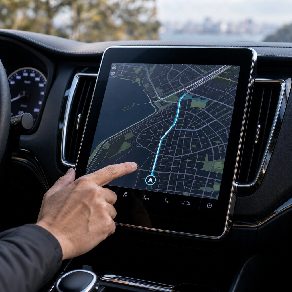
Within Skyline OS, map visibility improves when the rider uses a moderate zoom level, persistent turn banner, high-contrast day or night theme matched to conditions, and reduced nonessential widgets on the navigation screen. Riders often assume more information equals better guidance; in reality, too many tiles compete with road geometry. I recommend prioritizing current road, next maneuver, distance-to-turn, lane guidance, and fuel range. Secondary data such as media art or trip averages can move to a swipe screen. On test loops, riders consistently interpret maneuvers faster when the primary map pane has cleaner edges and fewer simultaneous color calls.
Brightness should be treated as the final adjustment, not the first. A display washed by direct sun may need full output, but overdriving brightness at dawn or dusk can reduce perceived contrast and fatigue the eyes. Anti-reflective screen protectors can help, though lower-quality films sometimes soften text and thin route lines. Helmet visor choice matters too. Mirrored or dark smoke visors can make a display appear richer in midday light, yet reduce symbol clarity in tunnels, rain, and tree cover. The most dependable setup is a clear or light-tint visor combined with display theme changes triggered by ambient conditions rather than fixed preference.
How Ergonomics Change by Harley-Davidson Model Family
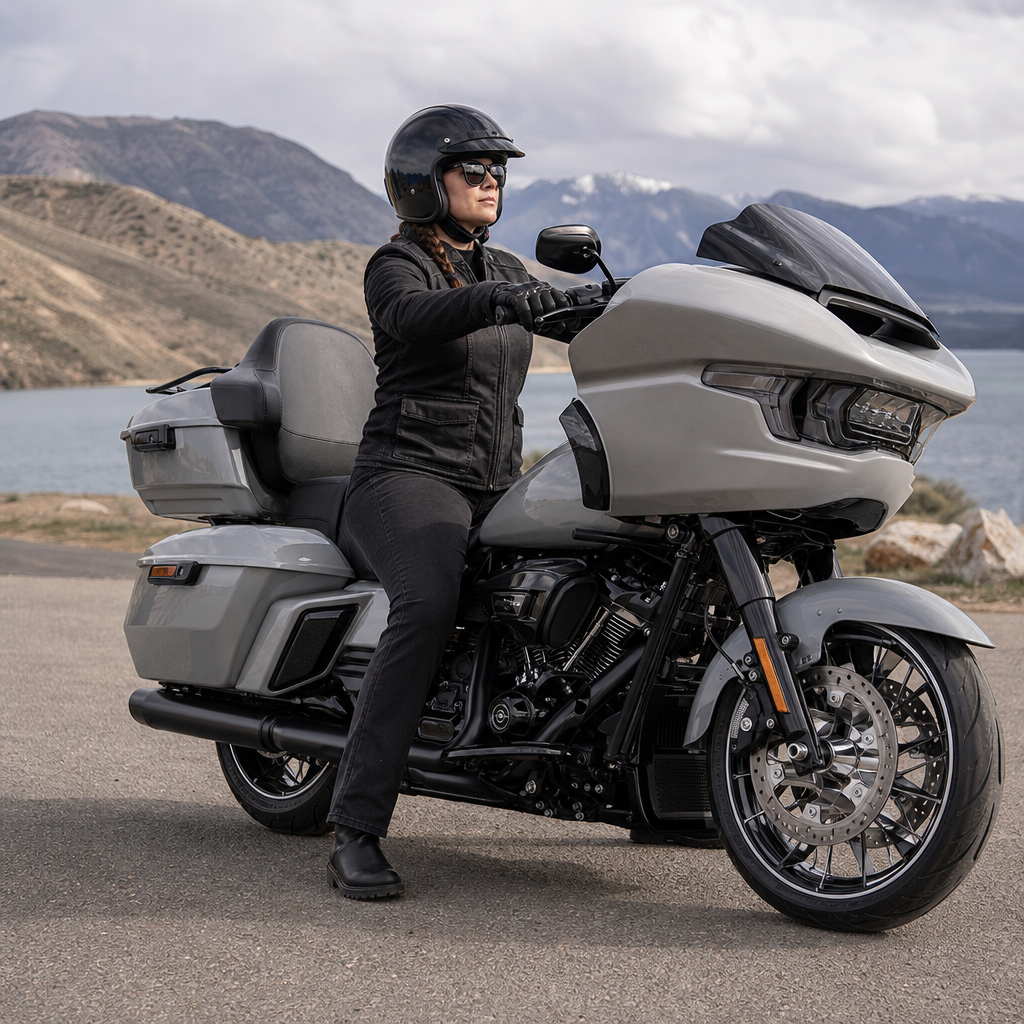
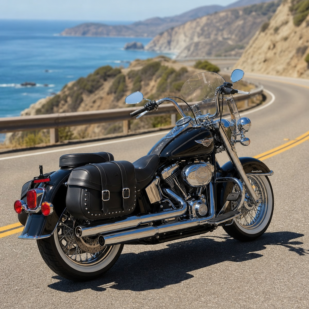
Not every 2026 Harley-Davidson places the rider, bars, fairing, and display in the same relationship. That is why one generic navigation setup guide never works well. Grand American Touring models usually provide the easiest environment for map readability because the batwing or frame-mounted fairing stabilizes airflow around the cockpit, reducing helmet shake during glances. However, these same bikes can produce strong midday reflections from wide tank consoles, gloss trim, and tall windscreens. The best touring recipe often includes careful windshield selection and slight seat-height tuning to place the rider’s eyes above the worst reflection band.
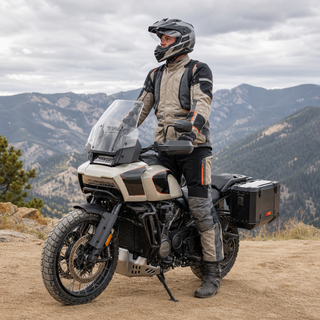
Adventure Touring models such as the Pan America line create a different challenge. Their taller suspension and upright posture help the rider scan quickly between road and display, but changing stand-over geometry, off-road boot bulk, and frequent transitions between seated and standing positions require a larger tolerance window. Here, the ideal Skyline OS recipe uses larger guidance elements, less dense data packing, and controls reachable with armored gloves. Because these bikes are used in rapidly changing light, automatic theme switching and conservative zoom settings outperform manually optimized, highly customized displays.
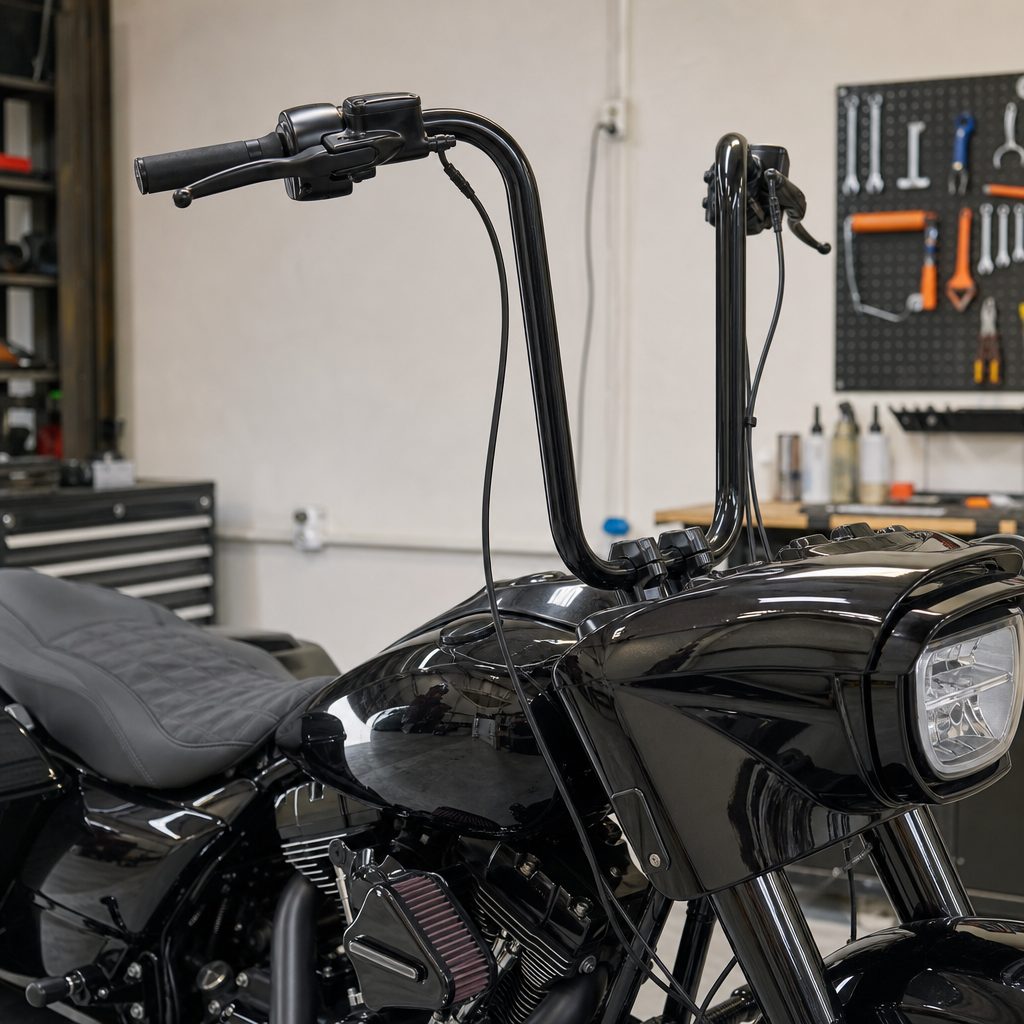
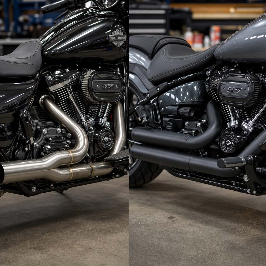
Cruiser and performance cruiser models often place the display lower and farther from the natural horizon line. The rider may be seated in a more rearward or feet-forward posture, which changes neck flexion during glances. On those motorcycles, the biggest gains usually come from mechanical fit adjustments: risers, bar sweep, seat contour, and suspension sag that reduce the effort required to drop the eyes to the screen. CVO and premium custom variants add another layer, because paint depth, trim finishes, and taller accessory screens can alter reflection patterns dramatically. A setup that works on a standard Street Glide may not translate directly to a CVO version with different cockpit surfaces.
| Model family | Typical visibility challenge | Best ergonomic fix | Best Skyline OS fix |
|---|---|---|---|
| Grand American Touring | Windscreen and tank reflections in bright sun | Seat height and windshield tuning | High-contrast theme with simplified map layout |
| Adventure Touring | Changing posture and variable outdoor light | Upright bar and control reach setup | Large guidance elements and auto theme switching |
| Cruiser | Low display position and longer glance angle | Riser, seat, and bar sweep adjustment | Moderate zoom and persistent turn banner |
| Performance Cruiser | Compact cockpit and vibration at speed | Neutral wrist angle and suspension balance | Reduced widgets and stronger route contrast |
| CVO / premium custom | Complex reflection from trim and accessory parts | Rider eye-line tuning with seat and screen choice | Brightness matched to conditions, not fixed maximum |
Display Settings That Actually Improve On-Road Readability
After ergonomic fit is addressed, software settings determine whether Skyline OS supports quick comprehension or overloads the rider. The first setting to audit is map orientation. Many riders prefer heading-up view because it mirrors what they see through the windshield. North-up is useful for planning but slower during active navigation on a motorcycle. The second setting is zoom behavior. If the system stays too far out, lane splits and short urban turns become visually compressed. If it stays too close, the rider loses context for upcoming exits. A dynamic medium zoom, if available, usually gives the cleanest balance.
Color and contrast are not cosmetic choices. They influence edge detection, which is how fast the eye separates the route line from surrounding roads. For daytime riding, muted land colors with a saturated route line outperform decorative map palettes. For night use, the best schemes keep black levels deep while preserving white text clarity and avoiding neon hues that bloom through visors. In my own testing, riders also perform better when secondary roads are visually deemphasized. That reduces map noise and helps the active route stand out, especially in urban grids where many parallel streets compete for attention.
Notification management is another overlooked factor. Skyline OS can present calls, media prompts, bike status notices, and navigation cues in close sequence. When too many interruptive overlays appear, the rider starts hunting for the route line instead of absorbing direction naturally. The fix is disciplined hierarchy. Navigation should take precedence during dense traffic, complex interchanges, or unfamiliar city centers. Media and low-priority alerts can wait. If the motorcycle supports rider profiles, create separate profiles for commuting, touring, and group rides. That is one of the most effective recipe tactics because it preserves clarity without forcing constant menu changes.
Wind, Vibration, Lighting, and Other Physical Variables
Even a perfectly configured display can become difficult to read when physical conditions degrade visual stability. Wind buffeting is the most common culprit. If a rider’s helmet shakes at highway speed, glance accuracy drops regardless of screen resolution. That is why windscreen selection is a navigation issue, not just a comfort issue. On touring Harleys, a windshield that is too tall may force the rider to look through optical distortion in rain; too short and airflow can strike the helmet peak or visor edge. The right height places the rider looking over the screen with smooth air hitting the upper helmet, not the face shield center.
Suspension setup also affects readability more than many owners expect. Excessive rear sag changes the chassis attitude, which subtly shifts the rider’s eye line and can increase glare from the screen surface. It can also alter how the bike reacts to expansion joints, making display glances less stable. I have corrected “bad screen visibility” complaints with preload changes alone. Tire pressure, fork condition, and engine mounting all matter as well. On a performance-oriented Harley, a cockpit that feels planted under braking and over rough pavement makes the map feel clearer because the rider’s visual frame is steadier.
Ambient lighting deserves a methodical approach. Midday overhead sun, low-angle sunrise, wet roads, and urban LED spill all affect display legibility differently. Polarized eyewear can interact unpredictably with some screens, darkening the image at certain head angles. Rain adds another layer by creating droplets on the screen or windscreen, which scatter light and reduce contrast. For riders who travel across conditions in one day, the most resilient recipe combines physical mitigation and software restraint: clear visor, carefully chosen shield, auto brightness enabled, simple map density, and a route line color that remains distinct against gray skies and reflective pavement.
Building Repeatable Recipes for Touring, Commuting, and Mixed-Surface Use
The best hub pages do not stop at theory; they give repeatable recipes riders can test. For long-distance touring, start with comfort stability. Set seat and bars for relaxed shoulders, choose a windshield that reduces helmet buffeting, enable the cleanest navigation layout, and use a medium zoom with lane guidance prioritized. For daily commuting, bias the system toward fast decision-making. Keep traffic overlays visible, maintain a persistent next-turn banner, and suppress nonessential notifications during rush hour. For mixed-surface or adventure use, favor large guidance graphics, auto theme switching, and settings that remain legible while standing on the pegs.
Every recipe should be validated with a short ride loop, not judged in the garage. I use a three-part test: a sunlit straight, a bumpy section, and a multi-turn urban segment. If the rider can identify the next maneuver within a brief glance across all three, the recipe is working. If not, change one variable at a time. Start with posture, then shield, then map density, then brightness. That sequence prevents random tweaking and leads to dependable results. Use this hub as your starting point, then explore the linked Harley-Davidson setup guides for your exact model, screen hardware, and riding style. A readable map is not luck. It is a tuned system you can build.
Frequently Asked Questions
1. Why is map visibility on a 2026 Harley-Davidson with Skyline OS about more than just turning up the screen brightness?
Because readability on the road is a systems issue, not a single setting issue. Skyline OS can present excellent route guidance, but if the rider cannot interpret it in a split second, the navigation experience breaks down. Brightness helps, but it does not solve glare, poor viewing angle, helmet visor tint, or the visual competition created by too much information on the display. On 2026 rides, map visibility is shaped by how the screen sits in the cockpit, how far the rider’s eyes are from the display, whether the windscreen changes the rider’s posture, how much direct sun hits the panel, and whether gloves make quick adjustments harder at the moment they are needed.
In real-world riding, a display can be technically bright and still be difficult to read. For example, a rider with a dark visor in late afternoon sun may perceive lower contrast even when the backlight is high. A taller windscreen can slightly alter head position, which changes the angle at which the display is viewed. That affects clarity, especially when reflections are present. Likewise, if the map is cluttered with too many labels, icons, or secondary data points, the route line and next maneuver cue can get visually buried. Optimizing Skyline OS navigation visibility means balancing contrast, layout, ergonomics, and rider interaction so the most important information stands out immediately without requiring prolonged eye time away from the road.
2. What settings in Skyline OS should riders adjust first to improve at-a-glance map readability?
The best starting point is to prioritize clarity over visual richness. First, verify display brightness behavior. If Skyline OS offers automatic brightness, test it in the lighting conditions you actually ride in, because some riders prefer manual control when transitioning between shaded roads, open highways, and sunrise or sunset conditions. The goal is not maximum brightness at all times, but strong contrast with minimal washout. Next, focus on map zoom level. A map that is zoomed too far out may show too much surrounding information and shrink the route guidance into something harder to interpret quickly. A map that is too zoomed in can force constant visual updates and reduce overall situational awareness. The ideal zoom is one that clearly shows the next maneuver, the route line, and immediate road context without clutter.
After that, review layer density and on-screen information hierarchy. If Skyline OS allows changes to labels, points of interest, traffic overlays, or supplemental panels, reduce anything that is not essential during active riding. The most useful navigation display is usually one where the route line, current road, distance to next turn, and turn direction are visually dominant. Riders should also evaluate color contrast, day versus night theme behavior, and whether lane guidance or turn banners appear prominently enough. Finally, test glove interaction while stationary. A display that looks good in the garage but is difficult to adjust with riding gloves can become frustrating on the road. A good recipe is simple: keep the route guidance large, the distractions minimal, and the information layout consistent enough that your eyes know exactly where to look every time.
3. How do windscreen height, rider posture, and cockpit ergonomics affect Skyline OS navigation visibility?
They matter more than many riders expect because they directly influence sightline, screen angle perception, and the amount of time required to read the display. Windscreen height can subtly change head and neck position, especially on longer rides. If a rider sits more upright or slightly farther back due to wind management, the display may be viewed from a different vertical angle than the one the bike’s cockpit naturally favors. That can increase reflections, reduce perceived contrast, or make smaller text harder to resolve at a glance. On some setups, a windscreen that improves comfort can also create a pocket of light or glare that lands on the screen differently throughout the day.
Rider posture is equally important. If the rider is reaching too far for the bars, leaning forward unnaturally, or sitting in a way that forces repeated head dips to read the display, navigation clarity suffers even when the screen itself is well configured. The best ergonomic setup allows the rider to check the map with a quick, natural eye movement rather than a deliberate head movement. Seat position, handlebar relationship, and even suspension setup can play a role in how stable that sight picture feels over rough pavement. Cockpit ergonomics also affect interaction. If the rider can access controls comfortably with gloved hands and without awkward repositioning, it becomes easier to make small adjustments when parked or stopped. In practice, optimizing Skyline OS visibility often means treating the display as part of the entire rider triangle rather than as an isolated screen.
4. What role do ambient light, helmet visor tint, and weather conditions play in navigation display visibility?
They are major variables, and they often explain why a setup that looks perfect in one situation feels mediocre in another. Ambient light changes the display’s perceived brightness and contrast constantly. Direct midday sun can flatten colors and increase reflective glare, while low-angle morning or evening light can create sharp hotspots that are even more distracting. Overcast conditions may reduce glare but can also make darker themes appear muted if contrast is not strong enough. Helmet visor tint adds another layer. A dark smoke visor, photochromic shield, or internal sun shade can improve comfort, but it also changes how the rider perceives color separation and screen brightness. If the route line, road background, and guidance prompts are too close in tone, tinted optics can make critical information blend together.
Weather matters as well. Rain droplets on the screen or visor can scatter light and soften fine details. Fogging, road spray, and even dust on the display can lower legibility more than riders realize. Gloves become especially important in bad weather, because touch responsiveness and precision may decrease if fingertips are wet or bulky. The practical approach is to build a navigation setup with margin. Use strong contrast, clear route highlighting, and larger guidance elements than you think you need in perfect conditions. Then test the setup in bright sun, shade, and low-light riding. A Skyline OS display recipe is truly optimized only when it remains readable across changing environmental conditions, not just in the garage or on a short fair-weather ride.
5. What is the best overall “recipe” for optimizing map visibility on 2026 rides using Skyline OS?
The best recipe starts with a visibility-first mindset: make the display easy to read in under a second. Begin by setting brightness and theme for strong contrast in your most common riding conditions, then verify that auto-adjustment behaves predictably if you use it. Next, simplify the map. Keep the route line bold, the next maneuver prominent, and unnecessary labels or overlays reduced whenever possible. Choose a zoom level that balances immediate turn information with enough road context to avoid surprises. If Skyline OS allows customization of information cards or side panels, place secondary data where it does not compete with navigation cues.
Then move to physical optimization. Sit on the bike in your normal riding posture, wearing your usual helmet and visor, and evaluate the display from real viewing angles. Check for glare at different times of day. Consider how windscreen height, seat position, and handlebar reach influence your natural eye line. Make sure you can interact with essential controls using your normal gloves, ideally while stopped, without hunting through menus. Finally, validate the setup on actual rides, not just during stationary setup. Test urban traffic, open highway, bright sun, and low-light conditions. A strong Skyline OS navigation visibility setup is one where the rider does not have to think about reading the screen. The route is obvious, the next action is clear, and the display supports safe, confident decisions with minimal visual effort.